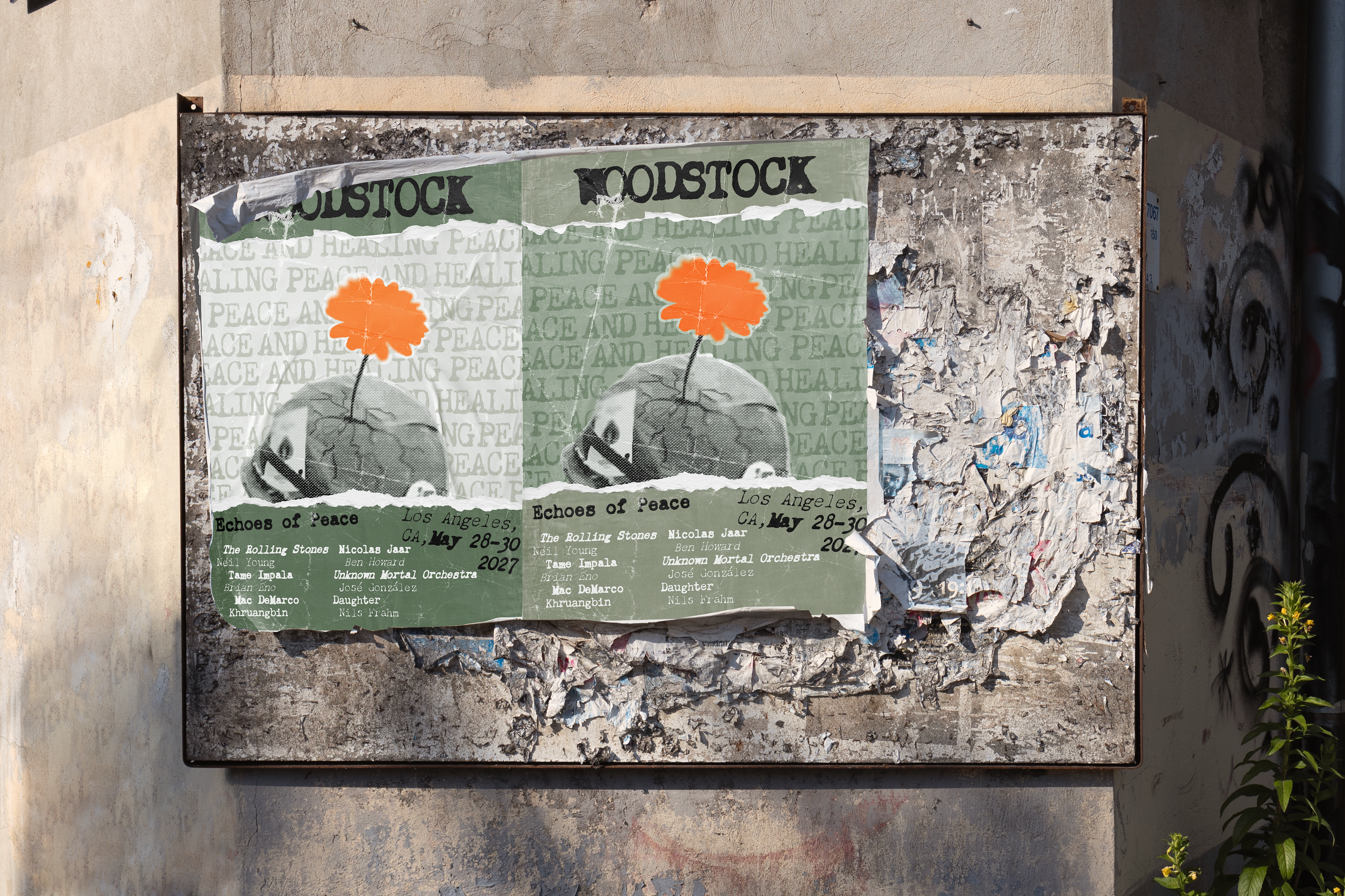
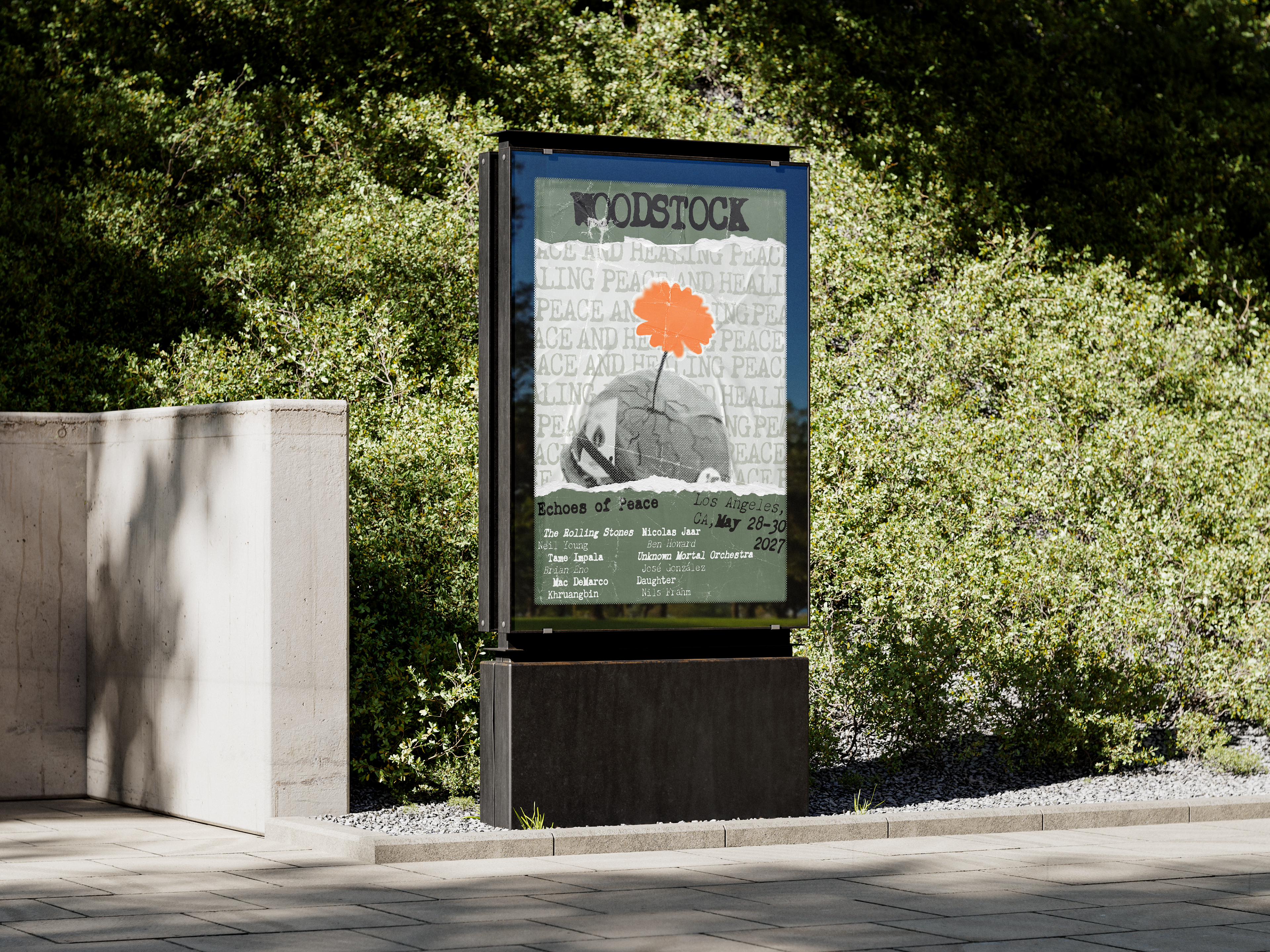
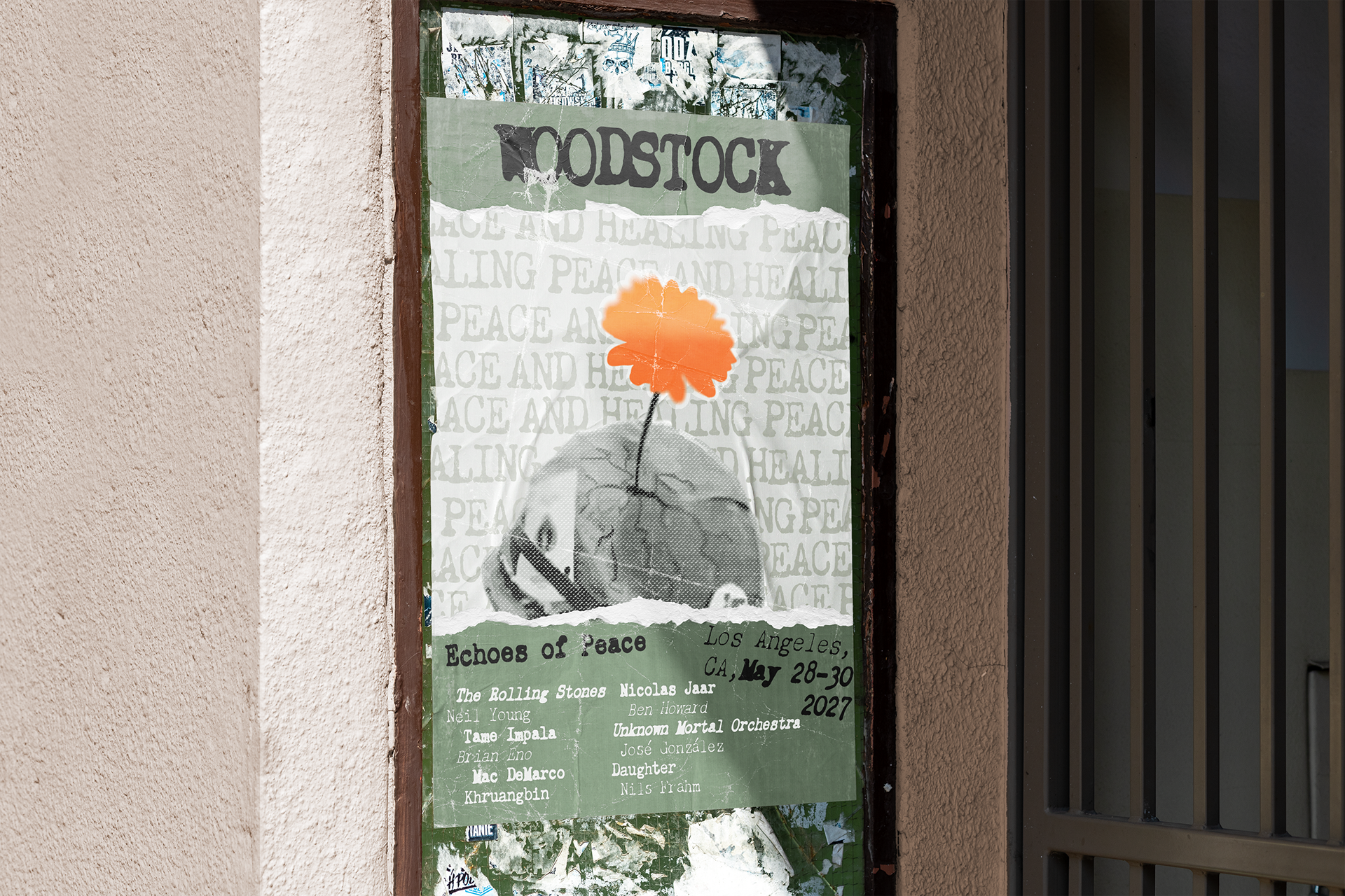
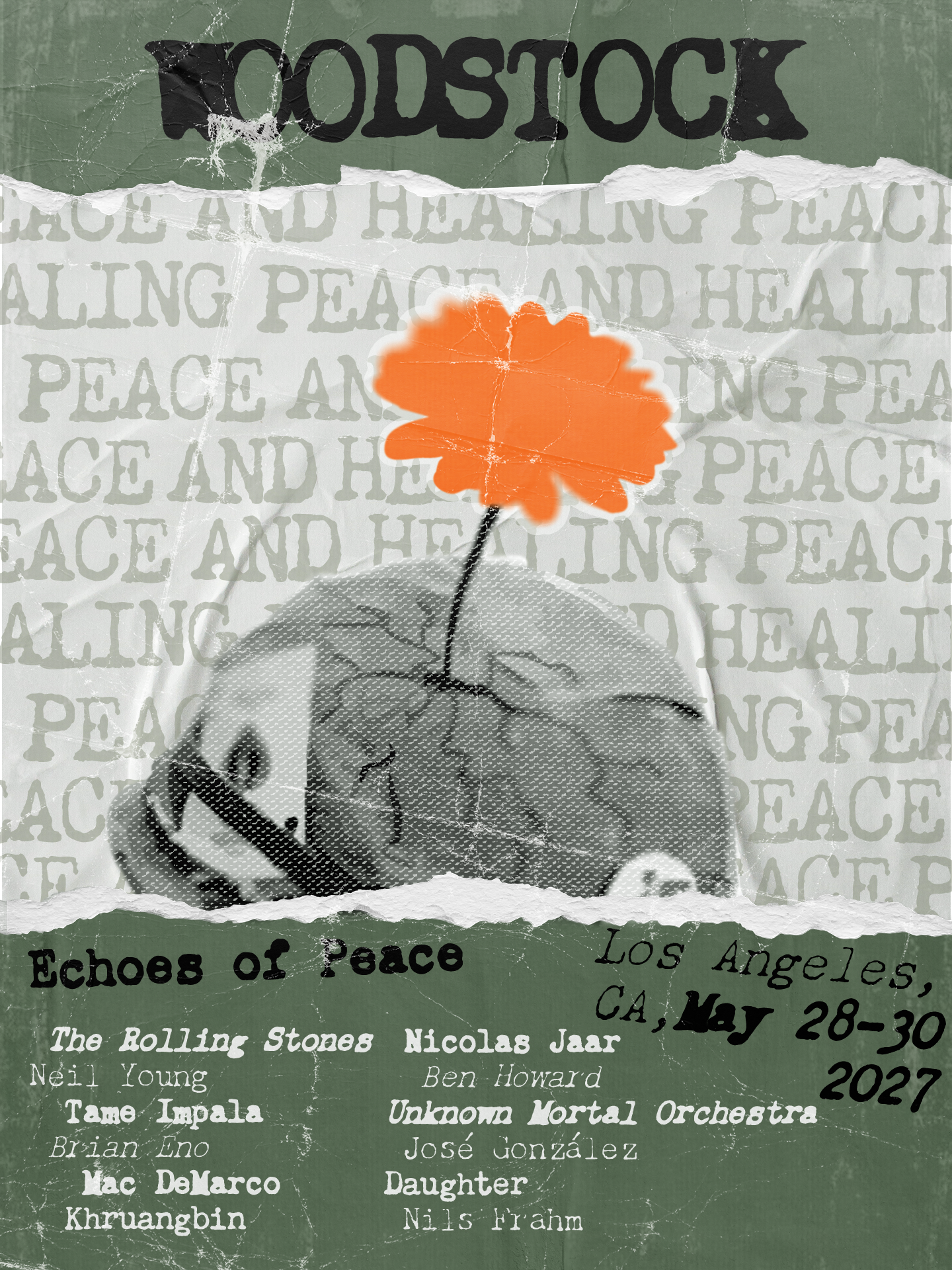
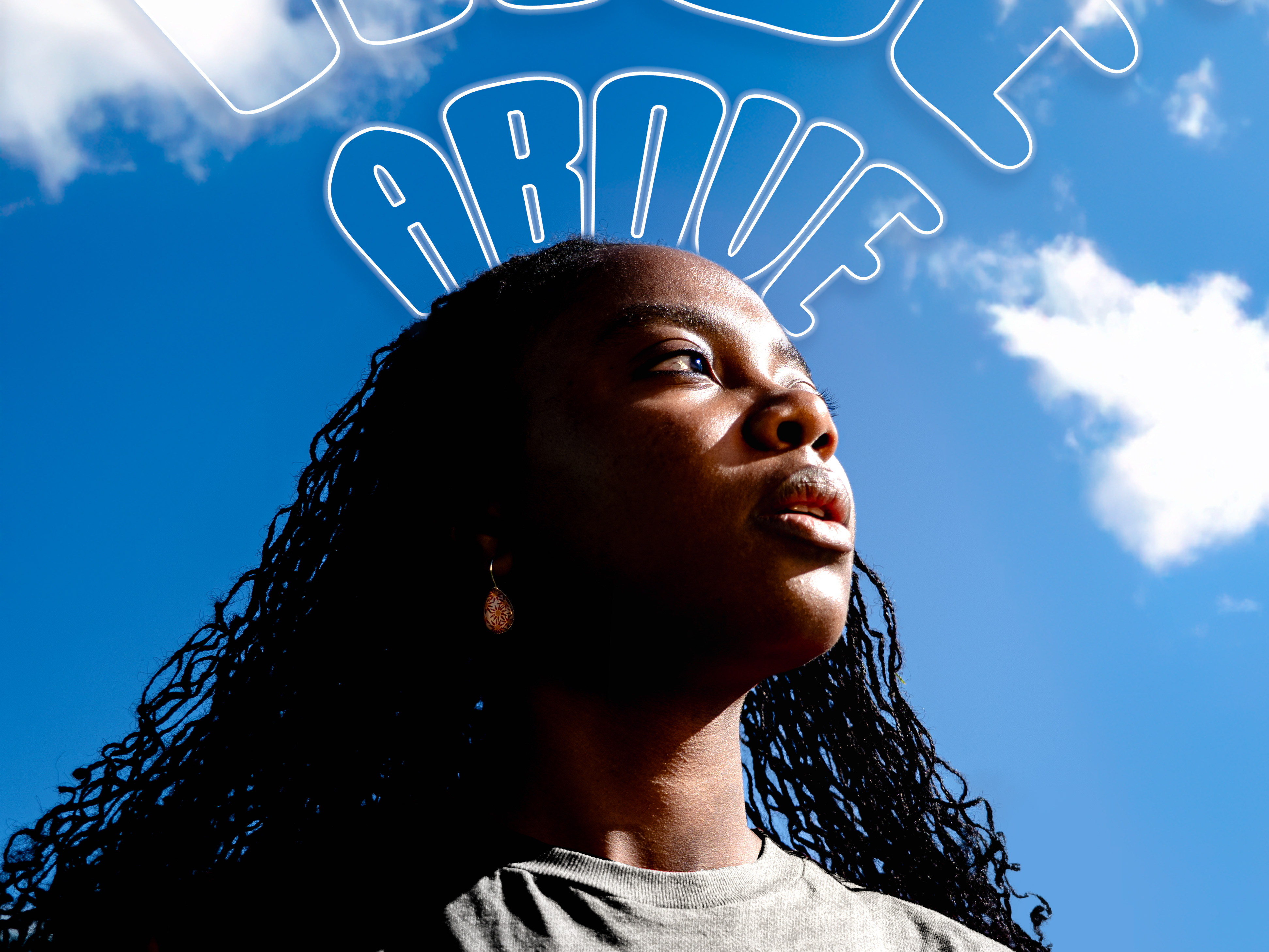
"Woodstock Rebranded" is a festival identity project that takes one of music history's most iconic brands and completely reimagines it for a new, unexpected audience — war veterans. Rooted in Woodstock's original DNA of peace, community, and healing, the rebrand strips away the counterculture nostalgia and rebuilds the visual identity around themes of restoration, brotherhood, and emotional recovery — values that resonate deeply with veterans transitioning back to civilian life.
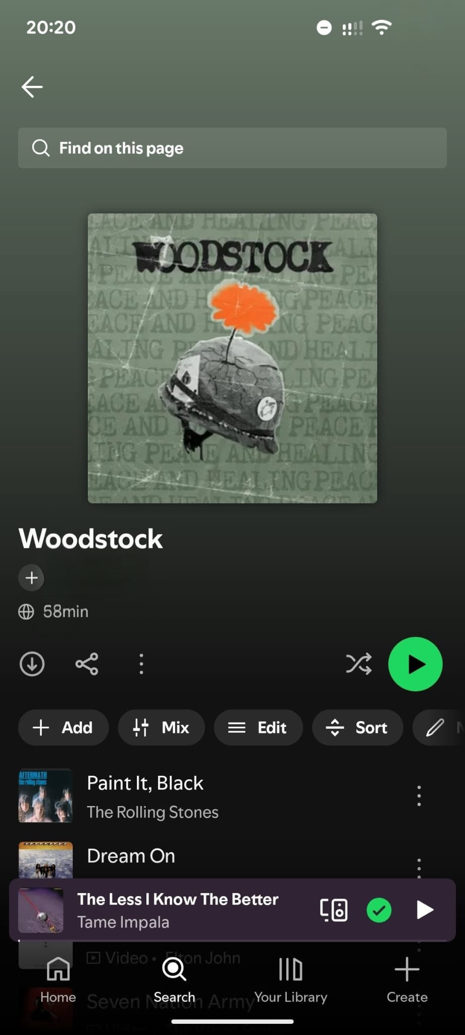
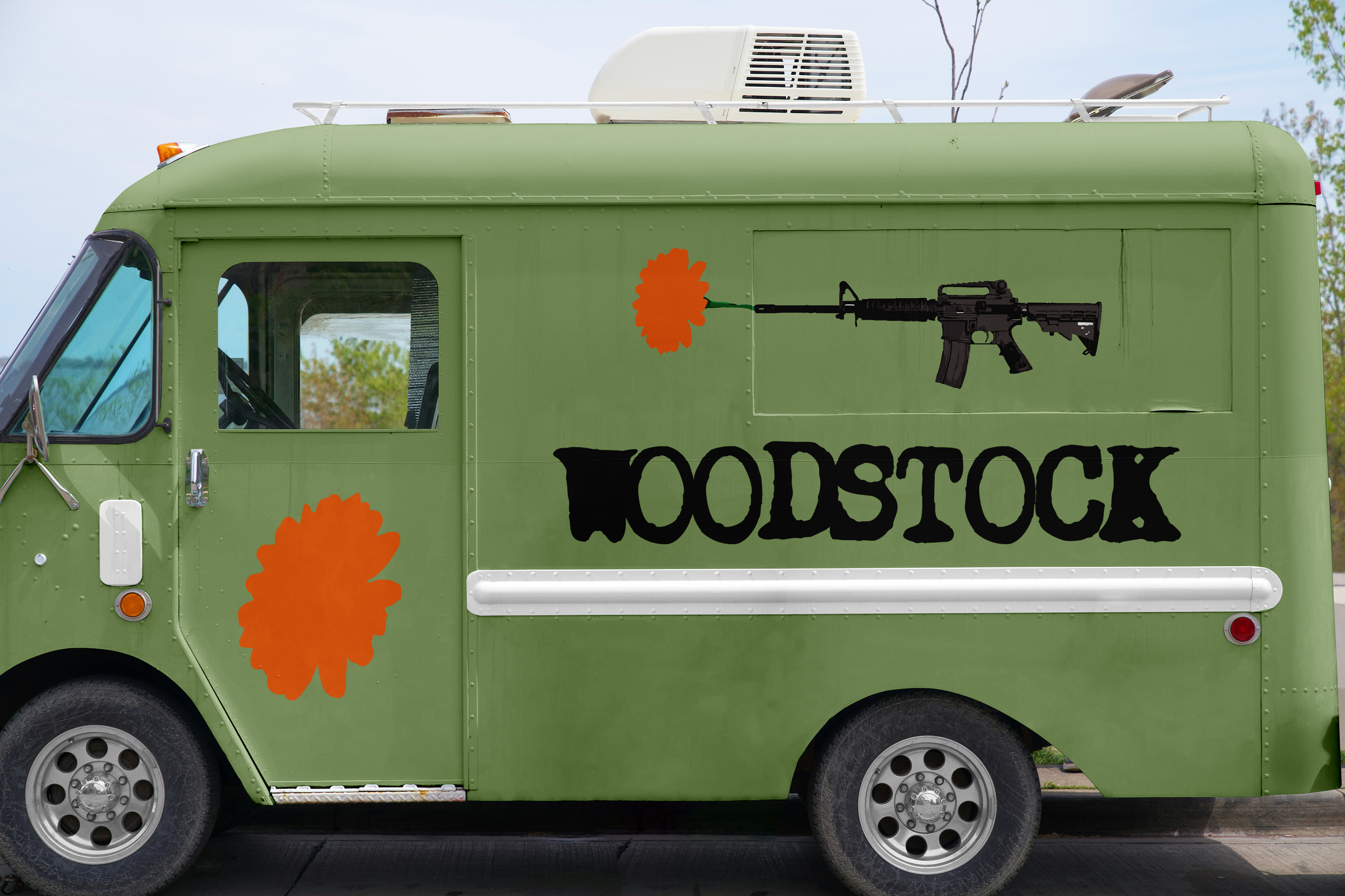
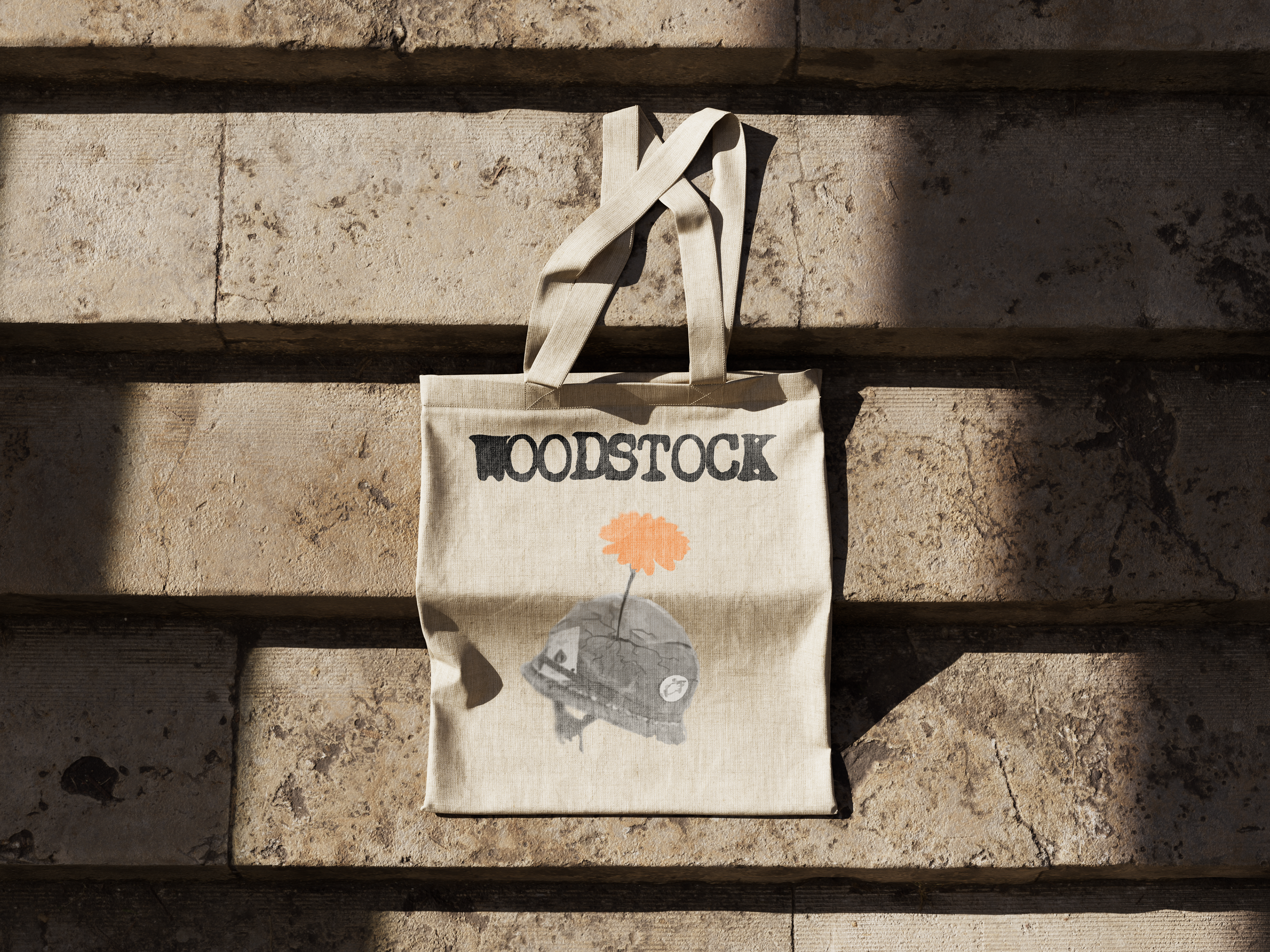
The process moved from research and audience definition, through mood boarding and concept development, to full design execution across every brand touchpoint — lineup poster, merchandise, social media assets, Spotify cover, food truck, and packaging. The final deliverable is a complete, cohesive visual system that proves Woodstock's core values were never uniquely American or generational — they are universal. Skills applied: brand strategy, audience research, visual identity design, typography, and multi-format design execution.